FE
플러터 위젯 기초 총정리 (1) — 화면 구성과 주요 UI 위젯
목차
대분류 | 소분류 | 세부 내용 |
? 1. 프로젝트 기본 구조 | 파일 구조 | 프로젝트 폴더 구조 설명 |
assets | 이미지, JSON 등 정적 리소스 저장 | |
fonts | 커스텀 폰트 저장 | |
lib | Dart 코드 파일 저장 | |
? 2. Flutter 기본 레이아웃 구조 | Scaffold Widget | Flutter 화면 기본 틀 |
AppBar | 상단 앱바 구성 | |
Body | 메인 콘텐츠 영역 | |
FloatingActionButton | 하단 오른쪽에 떠 있는 버튼 | |
NavigatingBar | 하단 네비게이션 바 | |
? 3. 상태 관리 (State) | State란? | UI의 데이터 변화 관리 개념 |
StatelessWidget | 상태가 없는 위젯 | |
StatefulWidget | 상태를 가지는 위젯 | |
? 4. 레이아웃 위젯 | Column & Row | 수직/수평 배치 위젯 |
Main Axis / Cross Axis | 주축, 교차축 정렬 | |
MainAxisSize | 공간 차지 크기 결정 | |
Stack | 위젯 겹쳐서 배치 | |
? 5. UI 요소 | Text | 텍스트 표시 |
스타일링 | bold, italic, overflow, selectable 등 | |
Button | 클릭 가능한 버튼 위젯 | |
ElevatedButton | 입체감 있는 버튼 | |
TextButton | 텍스트 중심 버튼 | |
IconButton | 아이콘 버튼 | |
DropdownButton | 드롭다운 메뉴 버튼 | |
Image | 이미지 표시 | |
asset vs network | 로컬 자원 vs URL 이미지 | |
Drawer | 옆에서 슬라이드되는 메뉴 | |
? 6. 리스트와 스크롤 | ListView | 스크롤 가능한 리스트 |
기본 구조 | children 속성으로 직접 위젯 나열 | |
반복문 활용 | for문으로 위젯 생성 | |
ListView.builder | 데이터 기반 위젯 생성 | |
ListView.separated | 아이템 사이 구분선 포함 리스트 |
파일 구조
1) assets
: 변경되지 않는 정적인 파일들이 위치한다.
Ex) image, logo, icon 등
2) fonts
: 기본적으로 제공하는 font가 아닌, 다른 폰트를 사용하고 싶을 때, font 파일을 생성하여 파일을 넣을 수 있다.
3) lib
: 프로젝트가 만들어질 때 생성되는 기본 파일(폴더)이다.
거의 모든 작업이 lib 폴더에서 이루어진다.
Scafford Widget 구조
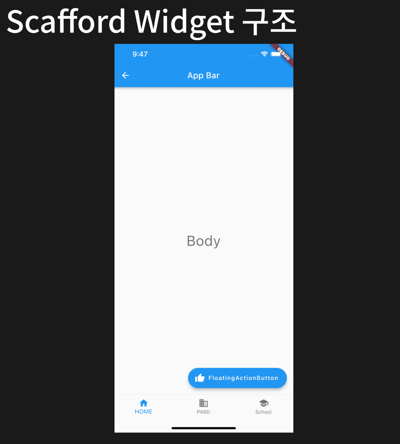
1) AppBar
: 앱의 최상단에 노출되는 위젯으로, Title과 다양한 Button을 넣을 수 있다.
2) Body
: Scaffold에 하위 하나의 위젯을 연결하는 속성이다.
3) FloatingActionButton
: 화면 위에 떠 있는 효과를 주는 버튼을 말한다.
4) NavigatingBar
: 앱의 '화면 전환'을 도와주는 하단 네비게이션 버튼이다.
// 예시 코드

class _MyHomePageState extends State<MyHomePage> {
  @override
  Widget build(BuildContext context) {
    return Scaffold(
      appBar: AppBar(leading: Icon(Icons.arrow_back), title: Text('App Bar')),
      bottomNavigationBar: BottomNavigationBar(
        items: const <BottomNavigationBarItem>[
          BottomNavigationBarItem(icon: Icon(Icons.home), label: 'Home'),
          BottomNavigationBarItem(icon: Icon(Icons.business), label: 'PARD'),
          BottomNavigationBarItem(icon: Icon(Icons.school), label: 'Schoole'),
        ],
      ),
      body: Center(
        child: Column(
          mainAxisAlignment: MainAxisAlignment.center,
          children: <Widget>[
            Text('Body', style: Theme.of(context).textTheme.headlineLarge),
          ],
        ),
      ),

      floatingActionButton: FloatingActionButton.extended(
        onPressed: () {
          // 기능을 넣는 곳
        },
        tooltip: 'Increment',
        label: Text('FloatingActionButton'),
        icon: Icon(Icons.thumb_up),
      ),
    );
  }
}
State란?
: State는 위젯의 상태를 저장하며, 위젯이 생성될 때, 위젯의 속성을 유지하는 객체이다.
1) Stateless 위젯과 Stateful 위젯의 차이
(1) Stateless 위젯
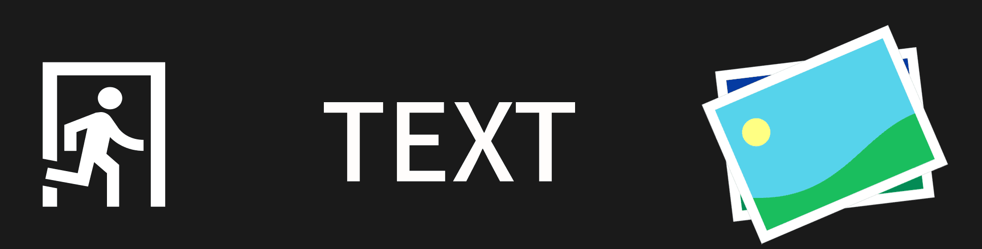
: 상태를 저장하지 않는 위젯일 때 사용된다.
Icon, Image, Text와 같은 위젯은 사용자의 입력이나 데이터 수신 등에 의해 발생하는 이벤트에 의해서 상태가 변경되지 않으며, Stateless의 하위 위젯이다.
(2) Stateful 위젯

: 상태를 저장해주는 위젯으로 사용된다.
Checkbox, Radios, Slider, InkWell, Form, TextField 같은 Stateful 위젯은 사용자의 입력이나, 데이터 수신 등에 의해 발생한 이벤트에 의해서 위젯의 모양이 변경될 수 있으며, StatefulWidget의 하위 클래스이다.
Column & Row
1) Column
: 세로 방향에 대한 레이아웃을 잡을 때 사용한다.
2) Row
: 가로 방향에 대한 레이아웃을 잡을 때 사용한다.
3) 예시 코드
body: Column(
  children: <Widget>[

    // 세로
    Column(
      children: <Widget>[Text('PARD'), Text('with'), Text('app part')],
    ),

    // 가로
    Row(children: <Widget>[Text('PARD'), Text('with'), Text('app part')]),
  ],
),
4) Main Axis / Cross Axis
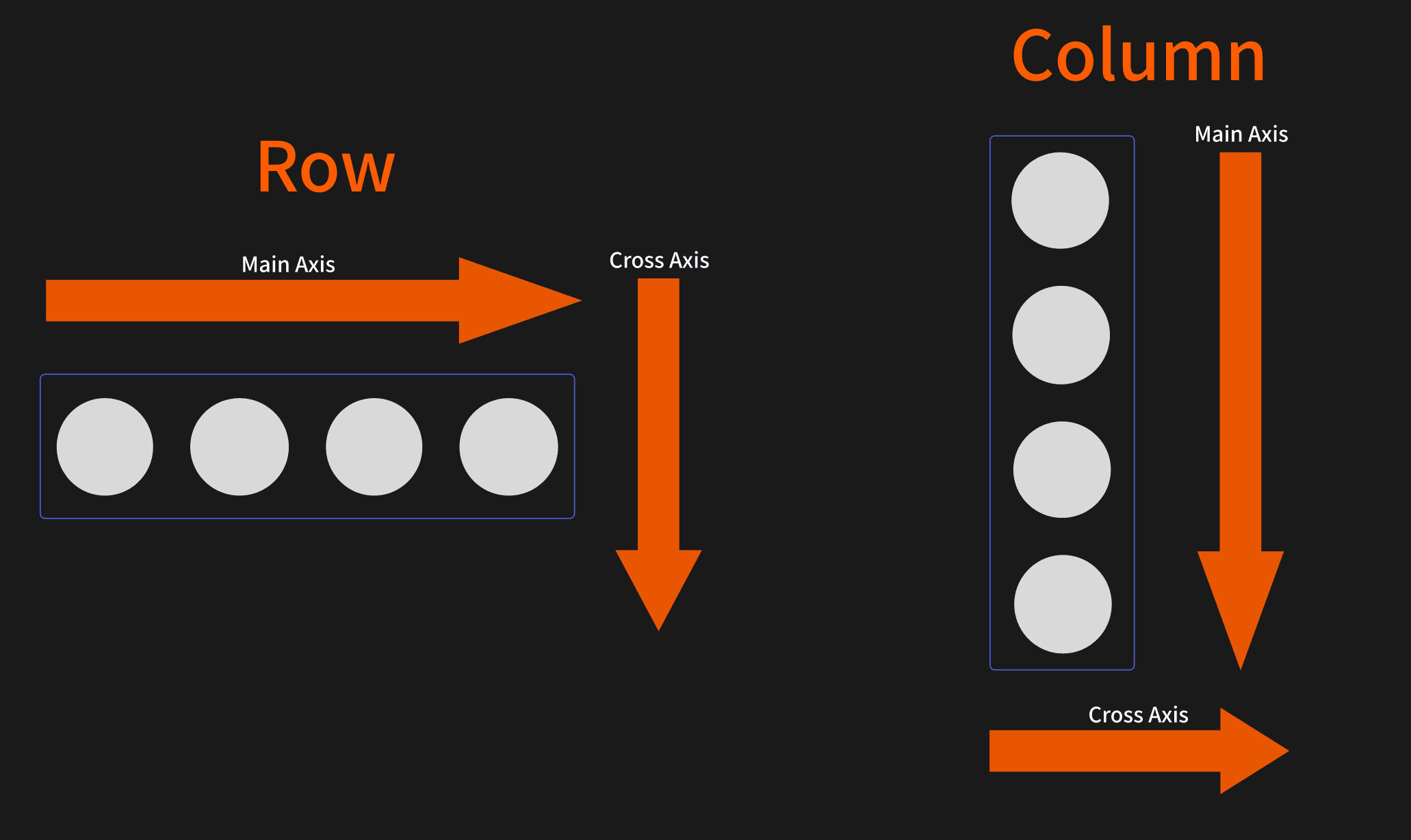
: Flutter에서 Row와 Column은 자식 위젯들을 축(Axis)을 기준으로 배치한다.
Main Axis(주축): 위젯이 늘어나는 방향
Row → 가로 방향
Column → 세로 방향
Cross Axis(교차축): 주축에 수직인 방향
Row → 세로 방향
Column → 가로 방향
(1) MainAxisAlignment
: 주축 방향(Row는 가로, Column은 세로)에서 자식 위젯을 어떻게 배치할지 결정한다.
start → 주축의 시작점에 배치
Row: 왼쪽 정렬 / Column: 위쪽 정렬
center → 주축의 가운데에 배치
end → 주축의 끝에 배치
Row: 오른쪽 정렬 / Column: 아래쪽 정렬
// 예시 (Column 기준)
Column( mainAxisAlignment: MainAxisAlignment.start, // 위쪽 children: [Text('A'), Text('B'), Text('C')], )(2) CrossAxisAlignment
: 교차축 방향(주축의 수직 방향)에서 자식 위젯을 어떻게 정렬할지 결정한다.
start → 교차축 시작점에 맞춤
Column: 왼쪽 정렬 / Row: 위쪽 정렬
center → 교차축 가운데 정렬
end → 교차축 끝에 맞춤
Column: 오른쪽 정렬 / Row: 아래쪽 정렬
// 예시 (Column 기준)
Column( crossAxisAlignment: CrossAxisAlignment.start, // 왼쪽 정렬 children: [Text('A'), Text('B'), Text('C')], )
5) MainAxisSize.min or max
MaxinAxisSize.min: 자식 위젯의 '최소 크기에 맞게' Row 또는 Column의 크기가 결정되며, 이는 자식 위젯이 가지는 '최소한의 공간만 차지'하도록 하기 위해 사용된다.
MaxinAxisSize.max: 자식 위젯의 '최대 크기에 맞게' Row 또는 Column의 크기가 결정되며, 이는 자식 위젯이 가지는 '가능한 한 많은 공간만 차지'하도록 하기 위해 사용된다.
Stack
: Stack 위젯은 화면에 위젯들을 '쌓고 싶을 때' 사용한다.
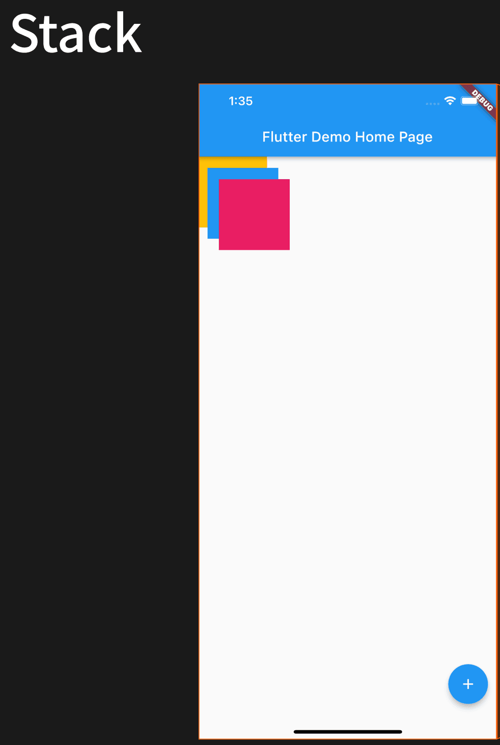
// 예시 코드 : lib/HomeStack.dart

import 'package:flutter/material.dart';

class HomeStack extends StatelessWidget {
  const HomeStack({super.key});

  @override
  Widget build(BuildContext contest) {
    return Stack(
      children: [
        Container(
          height: 100,
          width: 100,
          margin: EdgeInsets.all(0),
          color: Colors.amber,
        ),
        Container(
          height: 100,
          width: 100,
          margin: EdgeInsets.all(16),
          color: Colors.blue,
        ),
        Container(
          height: 100,
          width: 100,
          margin: EdgeInsets.all(32),
          color: Colors.pink,
        ),
      ],
    );
  }
}
Text
: 기본적인 '글'을 보여주는 위젯
1) overflow
: 텍스트가 주어진 영역을 넘어갈 때 어떻게 처리할지를 결정하는 옵션
부모 위젯의 가로 제한 유무 때문에 발생함.
제한이 없으면 overflow 조건이 발생하지 않고, 제한이 있으면 텍스트가 잘리면서 ellipsis 표시가 나타남.
import 'package:flutter/material.dart';

class HomeText extends StatelessWidget {
  const HomeText({super.key});

  @override
  Widget build(BuildContext contest) {
    var name = 'PARD';

    return Center(
      child: Column(
        mainAxisAlignment: MainAxisAlignment.center,
        children: [
          // Text의 overflow 발생 X
          Text(
            'Hello, $name! How are you?',
            textAlign: TextAlign.center,
            overflow: TextOverflow.ellipsis,
            style: const TextStyle(fontWeight: FontWeight.bold, fontSize: 25),
          ),

          // 높은 빈공간 박스
          const SizedBox(height: 50),

          // Text의 overflow 발생 O
          SizedBox(
            width: 200,
            child: Text(
              'Hello, $name! How are you?',
              textAlign: TextAlign.center,
              overflow: TextOverflow.ellipsis,
              style: const TextStyle(fontWeight: FontWeight.bold, fontSize: 25),
            ),
          ),
        ],
      ),
    );
  }
}
2) 볼드체(bold), 기울임(italic)
// 볼드체
TextSpan(
	text : '텍스트 내용',
    style : TextStyle(fontStyle : FontStyle.italic),
),

// 기울임
TextSpan(
	text : '텍스트 내용',
    style : TextStyle(fontWeight : FontWeight.bold),
),
3) 선택 영역
SelectionArea(
  child: Column(
    mainAxisAlignment: MainAxisAlignment.center,
    children: const [
      Text('Hello, We are PARD!', style: TextStyle(fontSize: 25)),
      SelectionContainer.disabled(
        child: Text(
          'Non-selectable text',
          style: TextStyle(fontSize: 25),
        ),
      ),
      Text('Selectable text', style: TextStyle(fontSize: 25)),
    ],
  ),
),SelectionArea는 자식 위젯들의 텍스트를 드래그로 선택할 수 있게 해준다.
SelectionContainer.disabled를 사용하면 해당 영역의 텍스트 선택 기능을 비활성화할 수 있다.
Button
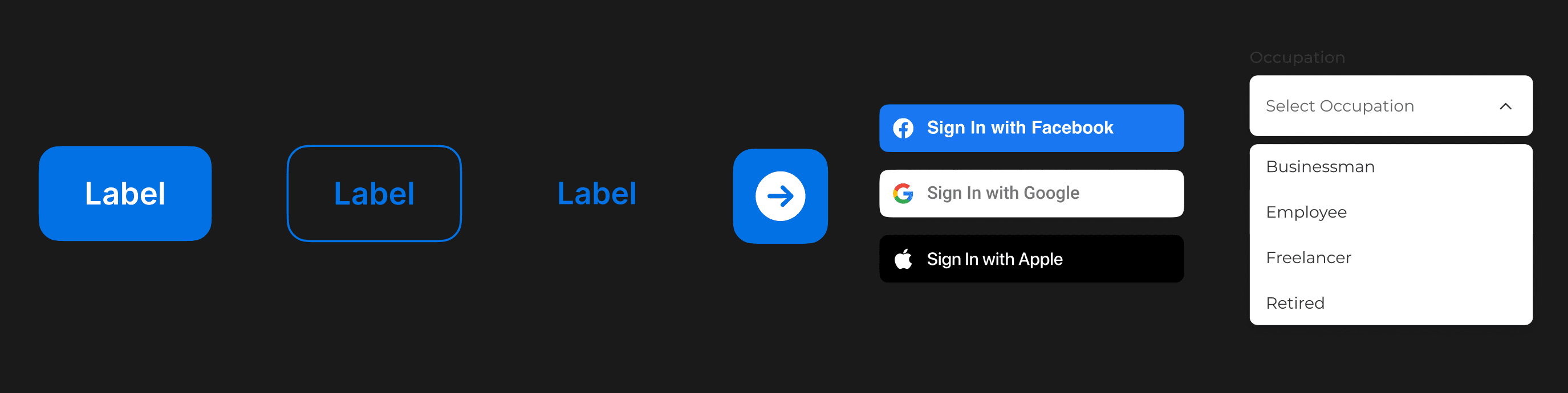
1) ElevatedButton
: Flutter에서 입체감 있는 기본 버튼 위
Material Design 스타일의 그림자와 배경색을 가지고 있으며,
onPressed에 함수를 넣으면 enabled 상태로 동작하고, null이면 disabled 상태로 비활성화된다.
import 'package:flutter/material.dart';

class HomeElevatedButton extends StatelessWidget {
  const HomeElevatedButton({super.key});

  @override
  Widget build(BuildContext contest) {
    return Column(
      children: [
        // Enable
        ElevatedButton(
          style: ElevatedButton.styleFrom(
            textStyle: const TextStyle(fontSize: 20),
            elevation: 10, // 버튼 그림자 깊이 (입체감)
            backgroundColor: Colors.deepOrange,
          ),
          onPressed: () {}, // 클릭 시 실행할 동작 (null이 아니므로 Enabled 상태)
          child: const Text('Enabled'), // 버튼에 표시할 텍스트
        ),

        // Disable
        ElevatedButton(
          style: ElevatedButton.styleFrom(
            textStyle: const TextStyle(fontSize: 20),
          ),
          onPressed: null, // null이면 Disabled 상태 (클릭 불가, 회색 처리)
          child: const Text('Disabled'), // 버튼에 표시할 텍스트
        ),
      ],
    );
  }
}
(1) enable : onPressed 콜백이 null이 아니어서 버튼이 동작 가능한 상태. 클릭 시 지정된 동작이 실행됨.
(2) disabled : onPressed가 null이라서 비활성 상태. 클릭해도 반응이 없고, 기본적으로 회색 톤으로 표시됨.
2) TextButton
(1) 기본
TextButton은 배경색 없이 텍스트 중심의 버튼.
onPressed에 함수가 있으면 활성화, null이면 비활성화.
styleFrom으로 폰트 크기, 색상, 패딩 등 스타일 지정 가능.
// Enable
TextButton(
  style: TextButton.styleFrom(
    textStyle: const TextStyle(fontSize: 20),
  ),
  onPressed: () {},
  child: const Text('Enabled', style: TextStyle(color: Colors.blue)),
),
(2) Gradient
ClipRRect로 모서리를 둥글게 자름.
Stack과 Positioned.fill + Container의 LinearGradient로 배경 그라데이션 생성.
그 위에 TextButton을 올려서 글자색·패딩·폰트 크기 설정.
// Gradient
ClipRRect(
  // 자식 위젯을 둥근 사각형 모양으로 잘라내는 위젯
  borderRadius: BorderRadius.circular(4), // 모서리 둥근 정도 (4px radius)
  child: Stack(
    // 여러 위젯을 겹쳐서 배치할 수 있는 위젯
    children: <Widget>[
      Positioned.fill(
        // 부모 영역을 가득 채우도록 배치
        child: Container(
          decoration: const BoxDecoration(
            // BoxDecoration: 배경, 테두리, 그림자 등을 설정
            gradient: LinearGradient(
              // 선형 그라데이션 배경
              colors: <Color>[
                Color(0xFF0D47A1), // 진한 파랑
                Color(0xFF1976D2), // 중간 파랑
                Color(0xFF42A5F5), // 밝은 파랑
              ],
            ),
          ),
        ),
      ),
      TextButton(
        style: TextButton.styleFrom(
          foregroundColor: Colors.white, // 버튼 텍스트/아이콘 색상
          padding: const EdgeInsets.all(16.0), // 버튼 안쪽 여백
          textStyle: const TextStyle(
            fontSize: 20,
          ), // 버튼 텍스트 스타일 (폰트 크기)
        ),
        onPressed: () {}, // 버튼 클릭 시 실행할 동작
        child: const Text('Gradient'), // 버튼에 표시될 텍스트
      ),
    ],
  ),
),
3) IconButton
(1) 기본
IconButton은 아이콘을 클릭 가능한 버튼으로 만드는 위젯.
onPressed에 함수가 있으면 활성화, null이면 비활성화.
color 속성으로 아이콘 색상 지정.
IconButton(
  onPressed: () {},
  icon: const Icon(Icons.android),
  color: Colors.black,
),
(2) 배경
IconButton 자체에는 배경색 속성이 없으므로, Ink나 Container로 감싸 배경을 추가.
Ink의 decoration 속성에서 ShapeDecoration을 사용해 색상과 모양(예: 원형) 지정.
감싼 뒤 내부의 IconButton에 아이콘과 색을 설정.
// 배경이 있는 IconButton
Ink(
  // 배경 및 도형 스타일 지정
  decoration: const ShapeDecoration(
    color: Colors.deepOrange,
    shape: CircleBorder(),
  ),
  child: IconButton(
    onPressed: () {},
    icon: const Icon(Icons.android),
    color: Colors.white,
  ),
),
4) DropdownButton
: DropdownButton은 선택에 따라 UI가 즉시 변해야 하므로 StatelessWidget 대신 StatefulWidget을 사용하고, StatefulWidget과 State 클래스를 분리해 고정적인 구조와 변경 가능한 상태를 관리한다.
(1) 두 개의 클래스 구조
StatefulWidget 클래스 (HomeDropDown)→ 위젯의 고정적인 구조(외형, 키 값 등)를 정의.
State 클래스 (_HomeDropDownState)→ 선택된 값(dropdownValue) 같은 변하는 데이터와 UI 빌드를 담당.
import 'package:flutter/material.dart';
// 드롭다운 버튼을 보여주는 StatefulWidget
class HomeDropDown extends StatefulWidget {
const HomeDropDown({super.key});
@override
State<HomeDropDown> createState() => _HomeDropDownState();
}
// 상태(State)를 관리하는 클래스
// 여기서 드롭다운의 현재 선택 값 등 변하는 데이터를 관리
class _HomeDropDownState extends State<HomeDropDown> {
// 드롭다운에 표시할 문자열 목록
final List<String> list = <String>['PARD', 'P', 'A', 'R', 'D'];
// 현재 선택된 값 (초기값 'PARD')
String dropdownValue = 'PARD';
@override
Widget build(BuildContext contest) {
return Center(
child: Column(
mainAxisSize: MainAxisSize.min, // Column의 세로 크기를 자식 위젯 최소 높이에 맞춤
children: <Widget>[
DropdownButton(
// 현재 선택된 값
value: dropdownValue,
// 드롭다운 오른쪽의 화살표 아이콘
icon: const Icon(Icons.arrow_drop_down),
// 드롭다운에서 선택된 항목의 텍스트 스타일
style: const TextStyle(color: Colors.deepOrange),
// 드롭다운 아래쪽 밑줄 모양 설정
underline: Container(height: 2, color: Colors.deepOrange),
// 값이 변경되었을 때 실행되는 콜백
onChanged: (value) {
setState(() {
// 새로운 값을 상태에 반영하고 UI를 재빌드
dropdownValue = value!;
});
},
// 드롭다운 항목 리스트 생성
// list의 각 요소를 DropdownMenuItem으로 변환
items: list.map<DropdownMenuItem<String>>((item) {
return DropdownMenuItem(
value: item, // 해당 항목의 실제 값
child: Text(item), // UI에 표시할 텍스트
);
}).toList(),
),
],
),
);
}
}Image
1) Image.asset 사용 방법
프로젝트 폴더 내 assets 폴더 생성
assets 폴더 내 이미지 파일 저장
pubspec.yaml 파일 내 assets 주석 해제
이미지 파일 경로 등록 후 저장
2) asset vs network
(1) asset
장점 : 사진 파일이 사라질 걱정이 없음
단점 : 앱 자체의 용량이 커짐
(2) network
장점 : 앱의 용량을 줄일 수 있음
단점 : URL이 사라지면, 이미지를 사용할 수 없음
3) 사용 예시
// asset
Image.asset(
  'assets/flutter-lockup.png',
  width: 300,
  height: 100,
  fit: BoxFit.contain,
),

// network
Image.network(
  'https://encrypted-tbn0.gstatic.com/images?q=tbn:ANd9GcRDl6MYXHMPJg-VkRIL3oEKwpgSQ9JkUJxWuQ&s',
  width: 300,
  height: 100,
  fit: BoxFit.contain,
),
Drawer
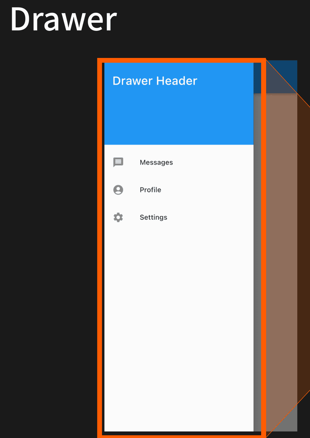
1) 역할
앱의 주요 메뉴나 설정 화면으로 이동할 수 있는 사이드 패널 역할.
보통 햄버거 메뉴(☰) 버튼을 눌렀을 때 화면 왼쪽에서 등장.
한정된 화면 공간에서 많은 메뉴를 숨겨두고, 필요할 때만 표시.
2) 기본 구성
Drawer: 사이드 메뉴 컨테이너.
ListView: 메뉴 항목들을 스크롤 가능하게 배치.
DrawerHeader: Drawer 상단 영역, 앱 로고나 사용자 정보 표시.
ListTile: 실제 메뉴 버튼(아이콘 + 텍스트 + 탭 동작).
3) 사용 방법
Scaffold(
  appBar: AppBar(title: Text('Drawer Example')),
  drawer: LayoutDrawer(), // 왼쪽 Drawer
  body: Center(child: Text('메인 화면')),
);
Drawer는 단독으로는 동작하지 않고, 보통 Scaffold 안에 넣어야 한다.
이렇게 하면 AppBar에 자동으로 햄버거 버튼이 생기고, 눌렀을 때 Drawer가 열린다.
4) 특징
기본 위치는 왼쪽(drawer:), 오른쪽에 두고 싶다면 endDrawer: 사용.
onTap 콜백을 활용해 페이지 이동, 설정 변경 등 다양한 동작 수행 가능.
Material Design 가이드라인에 맞춘 UI 제공.
5) 예시 코드
import 'package:flutter/material.dart';

class LayoutDrawer extends StatelessWidget {
  const LayoutDrawer({super.key});

  @override
  Widget build(BuildContext contest) {
    return Drawer( // 좌측 또는 우측에서 슬라이드로 열리는 네비게이션 메뉴 위젯
      child: ListView( // Drawer 내부의 스크롤 가능한 리스트
        padding: EdgeInsets.zero, // 기본 패딩 제거 (상단 여백 제거)
        children: <Widget>[
          const DrawerHeader( // Drawer의 상단 영역 (헤더)
            decoration: BoxDecoration(color: Colors.blue), // 헤더 배경색 설정
            child: Text(
              'Drawer Header', // 헤더에 표시할 텍스트
              style: TextStyle(color: Colors.white, fontSize: 24), // 글자색, 크기
            ),
          ),
          // 첫 번째 메뉴 항목
          ListTile(
            leading: const Icon(Icons.message), // 메뉴 왼쪽에 표시할 아이콘
            title: const Text('Messages'), // 메뉴 텍스트
            onTap: () {}, // 탭했을 때 실행할 동작
          ),
          // 두 번째 메뉴 항목
          ListTile(
            leading: const Icon(Icons.account_circle), // 아이콘
            title: const Text('Profile'), // 텍스트
            onTap: () {}, // 클릭 동작
          ),
          // 세 번째 메뉴 항목
          ListTile(
            leading: const Icon(Icons.settings), // 아이콘
            title: const Text('Settings'), // 텍스트
            onTap: () {}, // 클릭 동작
          ),
        ],
      ),
    );
  }
}
ListView
1) 역할
스크롤 가능한 위젯 목록을 표시하는 Flutter 위젯.
세로 또는 가로로 스크롤 가능하며,아이템 개수에 따라 화면을 넘어서면 자동으로 스크롤바가 생김.
정적인 데이터부터 동적으로 생성되는 데이터까지 모두 표현 가능.
2) 기본 구성
children: 직접 여러 위젯을 나열하는 방식. (소량의 위젯일 때 적합)
for 반복문: 일정 패턴의 위젯을 반복적으로 생성할 때 사용.
ListView.builder: 데이터 개수가 많거나 동적으로 생성될 때 메모리 효율적으로 아이템을 구성.
itemCount: 아이템 개수 지정.
itemBuilder: 각 인덱스에 해당하는 위젯 생성 로직 작성.
3) 예시 코드
(1) 원하는 만큼 위젯 사용
return ListView(
    padding: const EdgeInsets.all(8),
    children: <Widget>[
      Container(
        height: 50,
        color: Colors.deepOrange[600],
        child: const Center(child: Text('Entry A')),
      ),
      Container(
        height: 50,
        color: Colors.deepOrange[300],
        child: const Center(child: Text('Entry B')),
      ),
      Container(
        height: 50,
        color: Colors.deepOrange[100],
        child: const Center(child: Text('Entry C')),
      ),
    ],
  );
}
(2) 양이 많아, 반목문 사용
return ListView(
  padding: const EdgeInsets.all(8),
  children: [
    for (int index = 1; index < 21; index++)
      Container(
        height: 50,
        color: Colors.deepOrange[100],
        child: Center(child: Text('Entry $index')),
      ),
  ],
);
(3) ListView.builder 사용
용도
데이터 개수가 많거나 동적으로 변하는 리스트를 효율적으로 만들 때 사용.
스크롤 시 보이는 아이템만 렌더링하므로 메모리 절약에 유리.
특징
itemCount → 총 아이템 개수 지정
itemBuilder → 각 인덱스별 아이템 생성 로직 작성
final List<int> entries = <int>[
  1, 2, 3, 4, 5, 6, 7, 8, 9, 10,
  11, 12, 13, 14, 15, 16, 17, 18, 19, 20,
  21, 22, 23, 24, 25, 26, 27, 28, 29, 30,
];

return ListView.builder(
  padding: const EdgeInsets.all(8),
  itemCount: entries.length,
  itemBuilder: (context, index) {
    return Container(
      height: 50,
      color: Colors.deepOrange[100],
      child: Center(child: Text('Entry ${entries[index]}')),
    );
  },
);
(4) ListView.separated 사용 (child를 구분하여 표현)
용도
ListView.builder와 거의 동일하지만,아이템 사이에 구분선(Separator)을 넣을 수 있음.
특징
itemBuilder → 아이템 생성 로직
separatorBuilder → 아이템 사이에 들어갈 위젯 생성 로직
itemCount는 아이템 개수만 세고, Separator는 자동으로 중간에만 추가됨
final List<int> entries = <int>[
  1, 2, 3, 4, 5, 6, 7, 8, 9, 10,
  11, 12, 13, 14, 15, 16, 17, 18, 19, 20,
  21, 22, 23, 24, 25, 26, 27, 28, 29, 30,
];

return ListView.separated(
  padding: const EdgeInsets.all(8),
  itemCount: entries.length,
  itemBuilder: (context, index) {
    return Container(
      height: 50,
      color: Colors.deepOrange[100],
      child: Center(child: Text('Entry ${entries[index]}')),
    );
  },
  separatorBuilder: (context, index) =>
      const Divider(thickness: 1, color: Colors.orange),
);
다음에 배울 내용
GridView
AlertDialog
SnackBar
Checkbox
Radio
Switch
TextField
TextFormField